Leila Davies
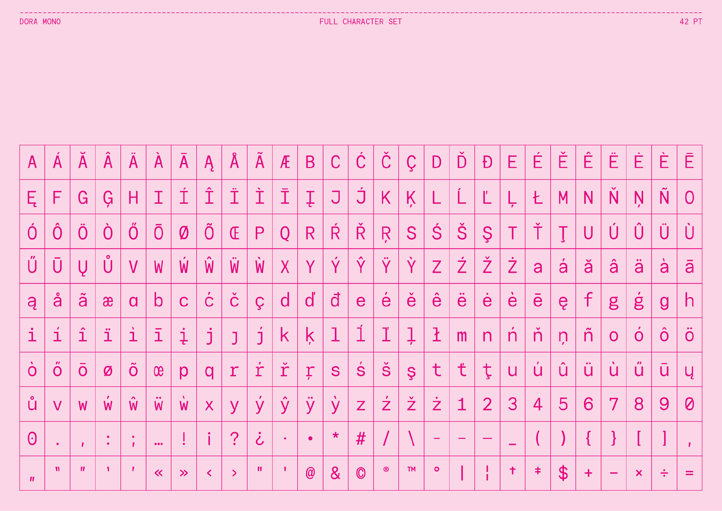
Dora Mono
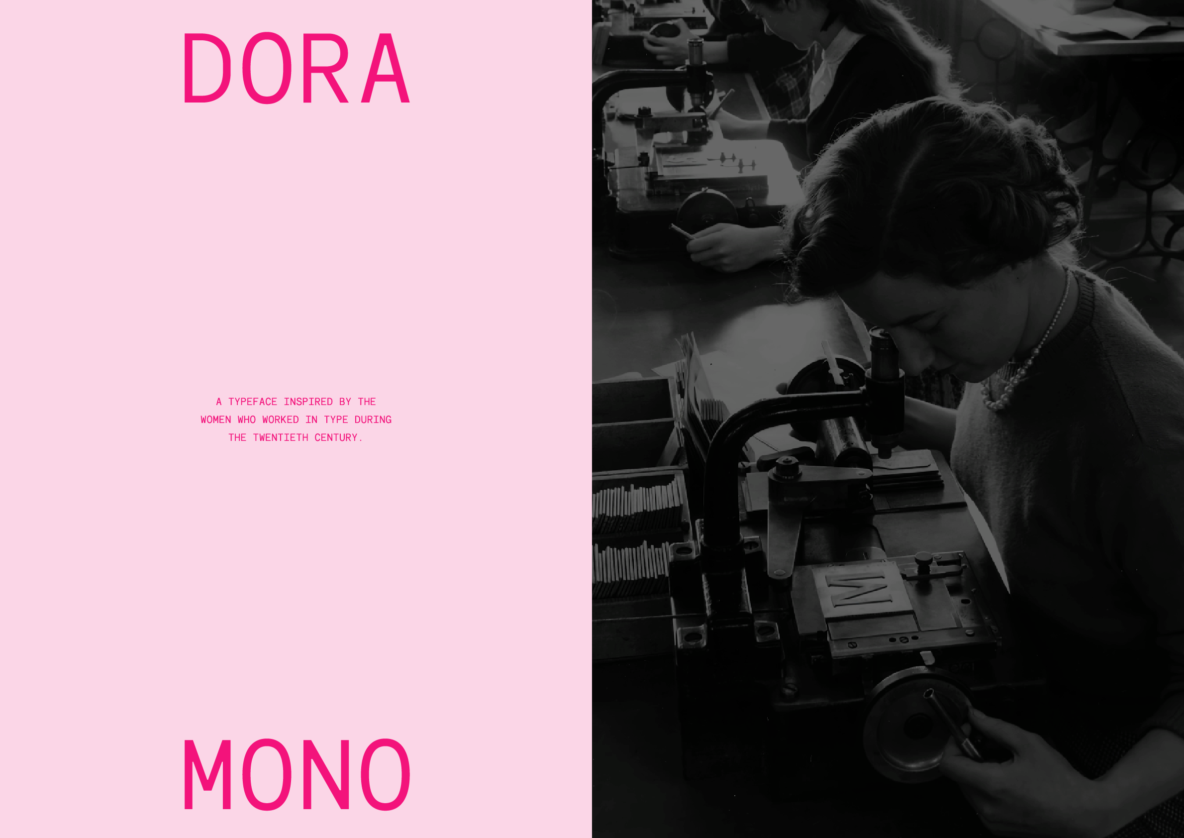

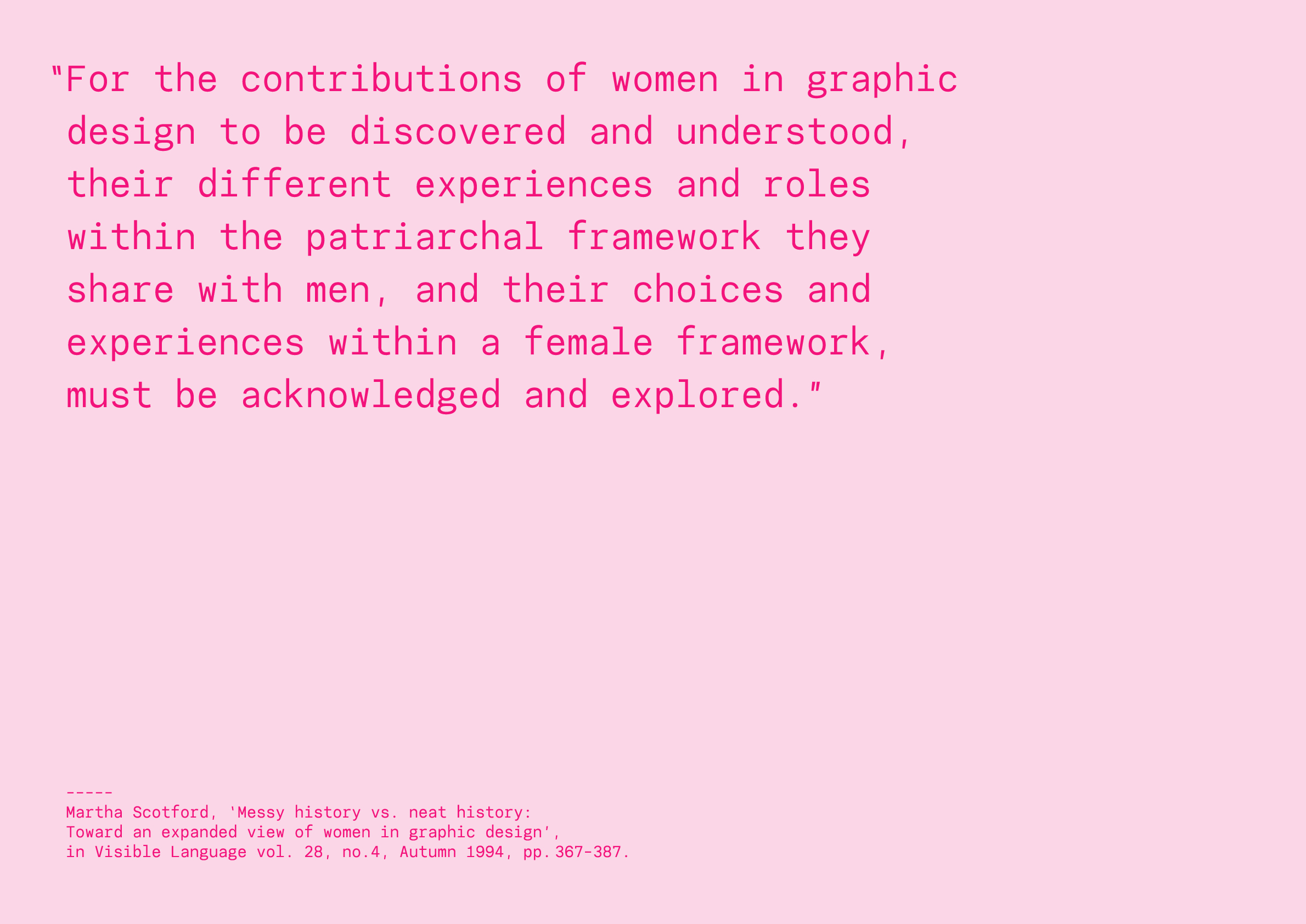
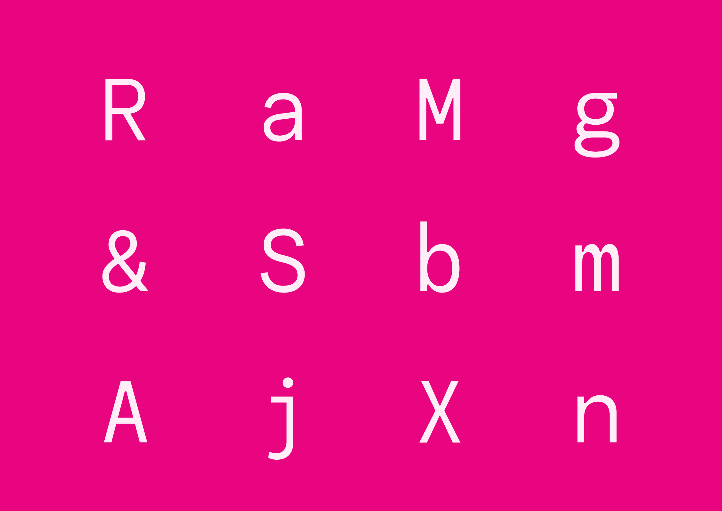
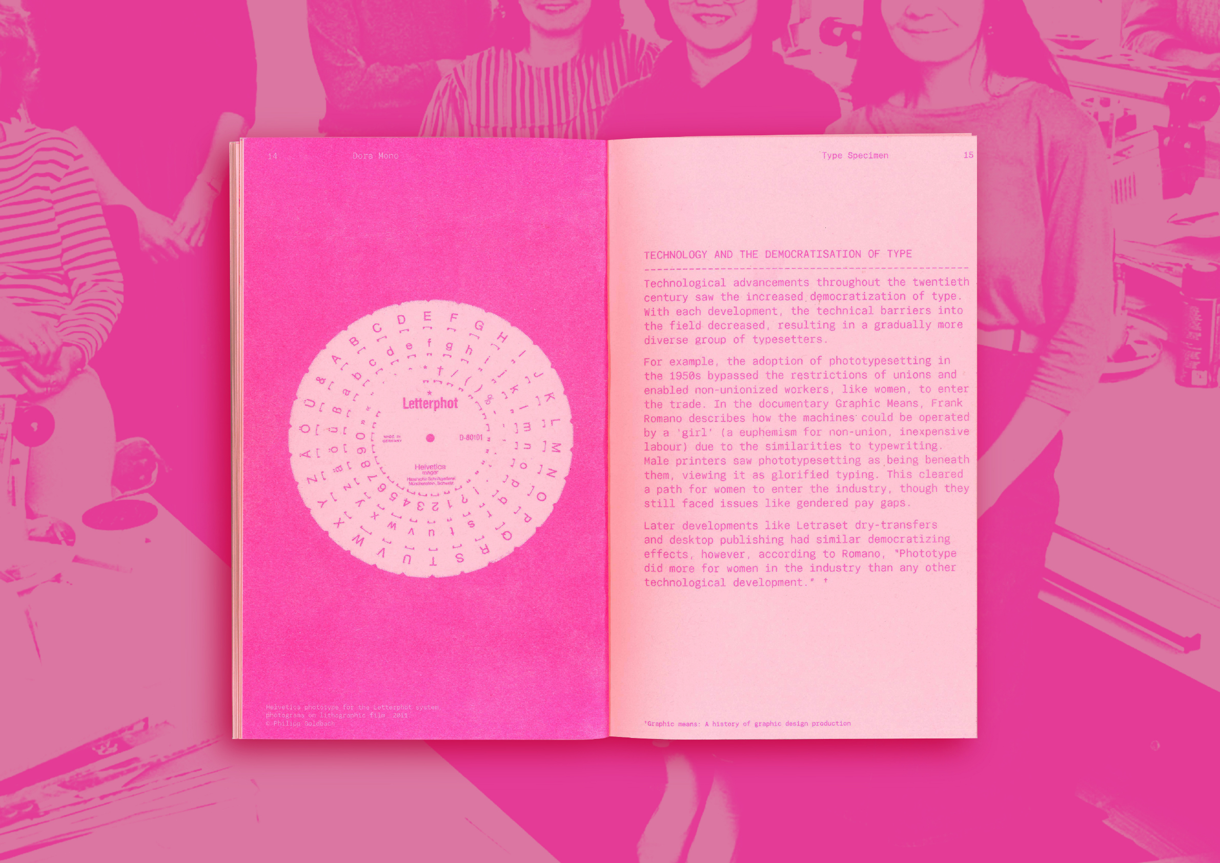
Dora is a monospace typeface which pays homage to women who worked in type during the twentieth century. It is named after two long-serving employees of Monotype’s Type Drawing Office – Dora Laing and Dora Pritchett. Instead of conforming to the overly decorative stereotypes of a ‘feminine’ typeface, Dora embodies the qualities of the women it honours: practical, precise, resilient and intelligent. The letterforms have also been influenced by the technological shifts which redefined women’s roles in the industry through this era: hot-metal type, phototype and early digital type.
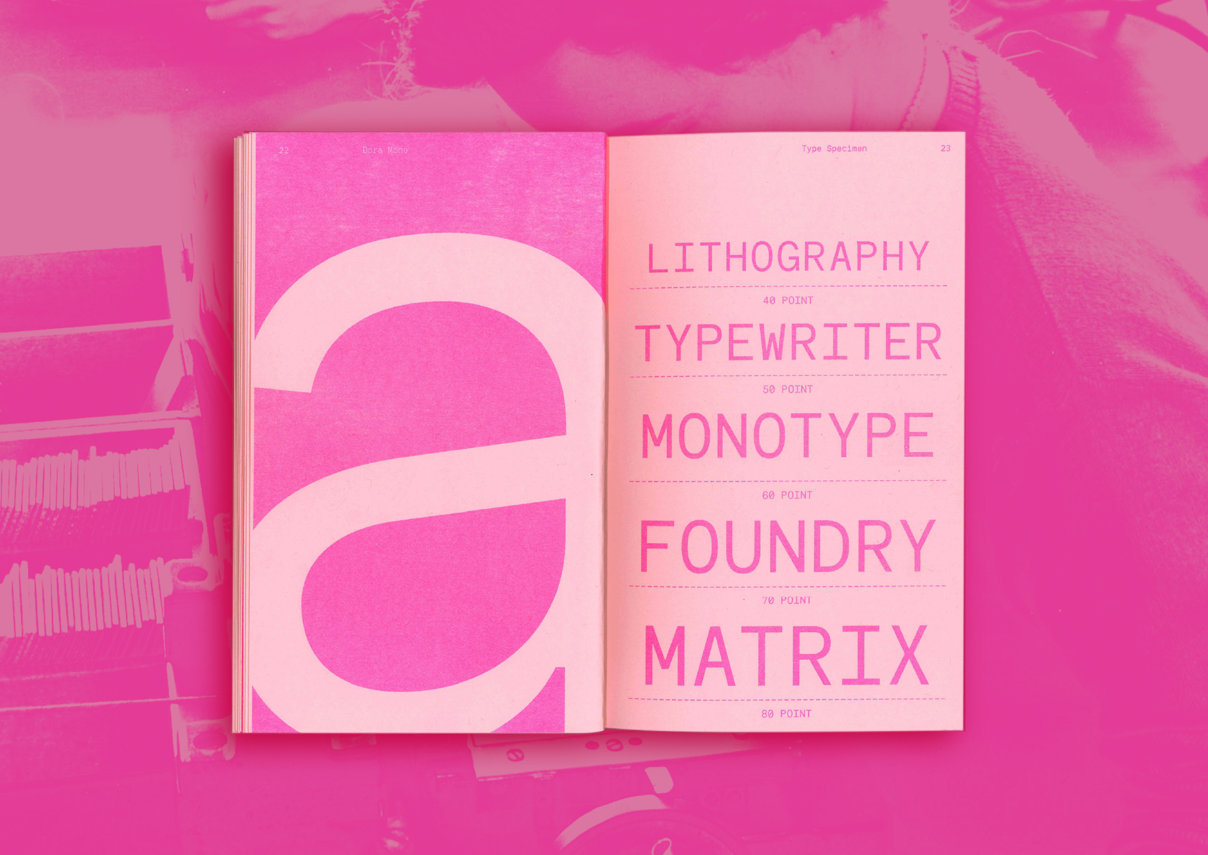
This project has grown from my interest in, and study of type history and feminist design theory. Some of this research has been included in the type specimen to provide context for the typeface. The specimen has been risograph printed to reference the punk aesthetic of the 1990s – a nod to female designers who began vocalizing important questions on representation in the industry during this period.
My design practice is often type-led. It is grounded in historical research as well as analogue processes which connect my ideas to a material form.